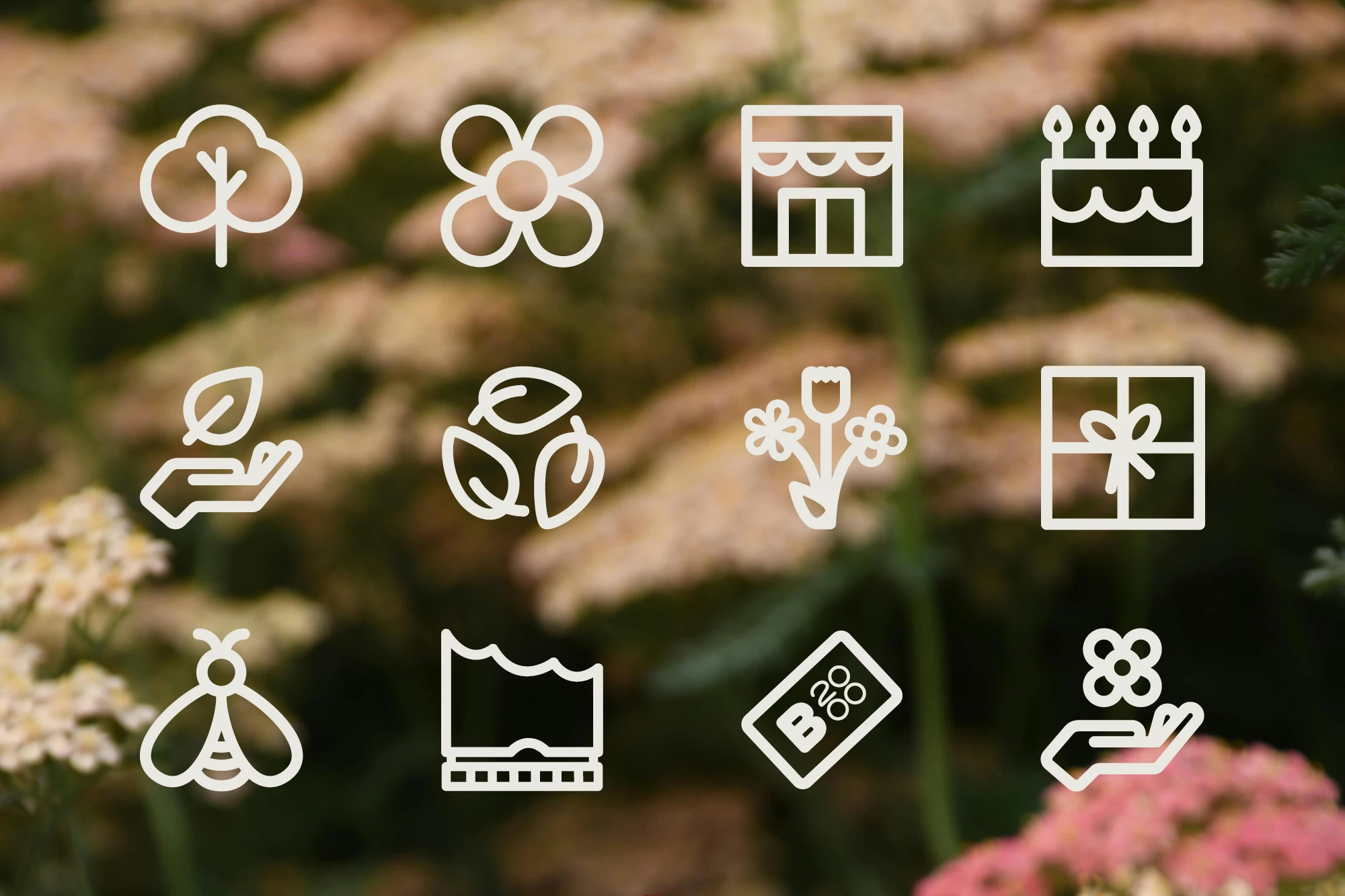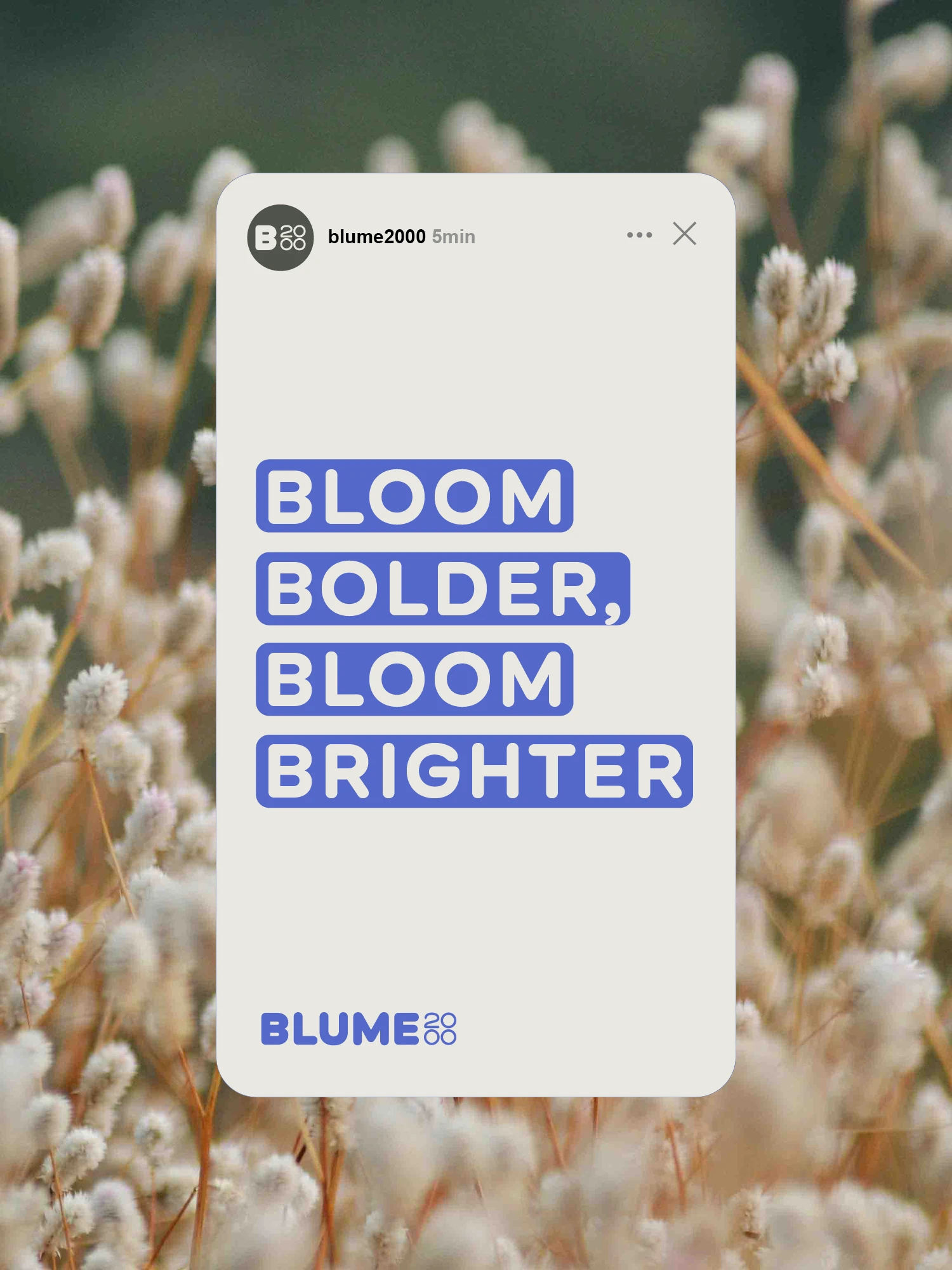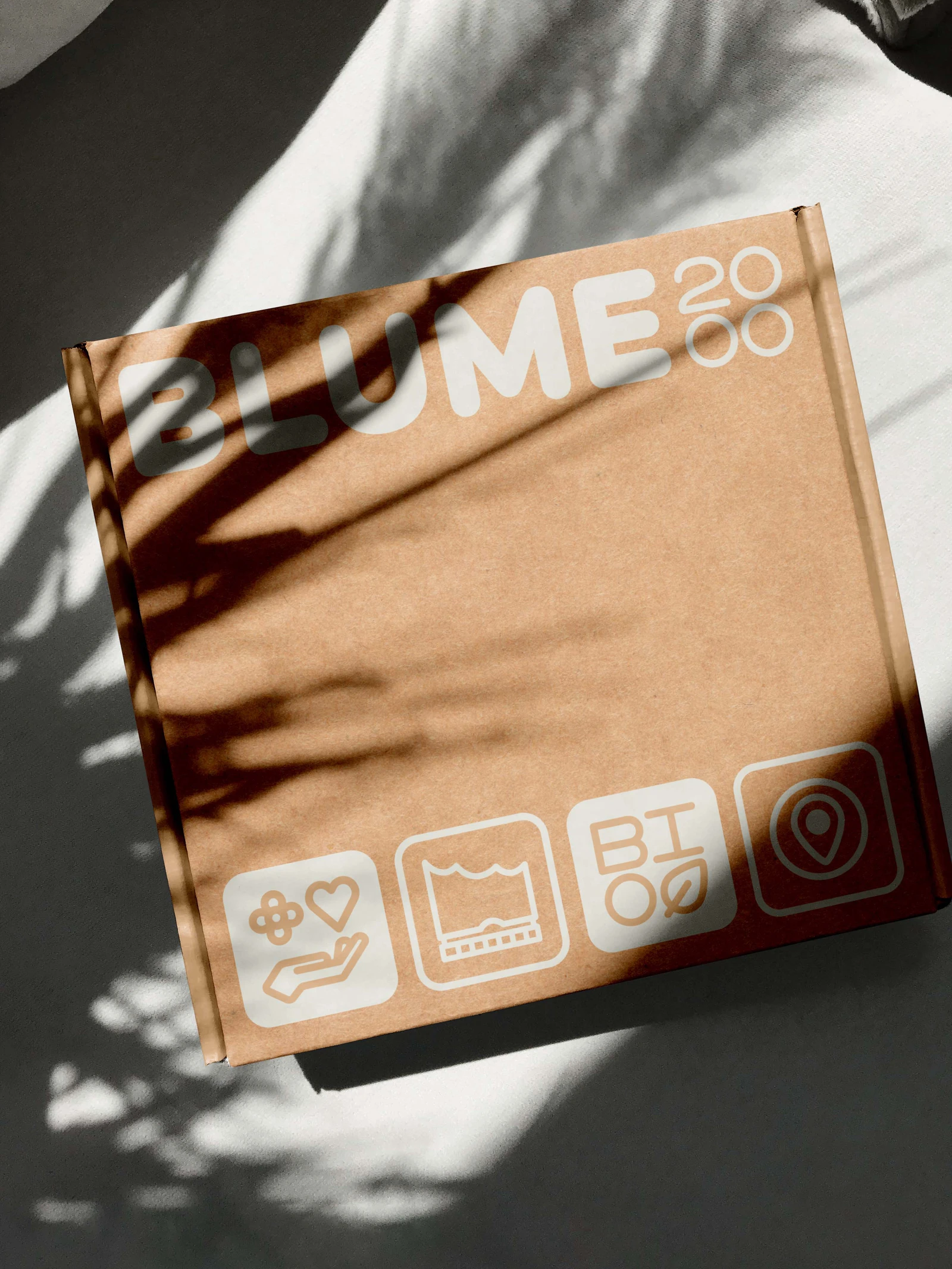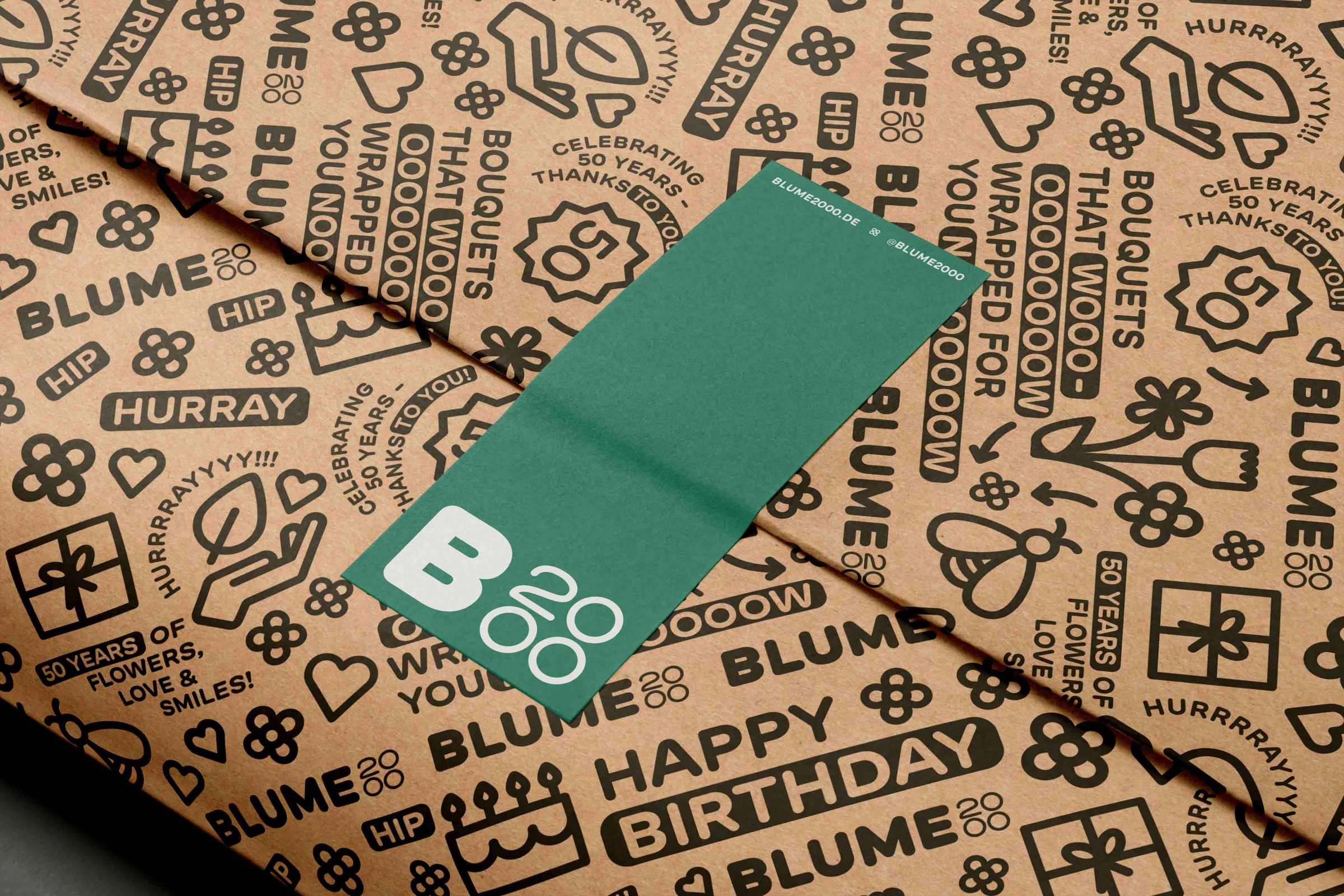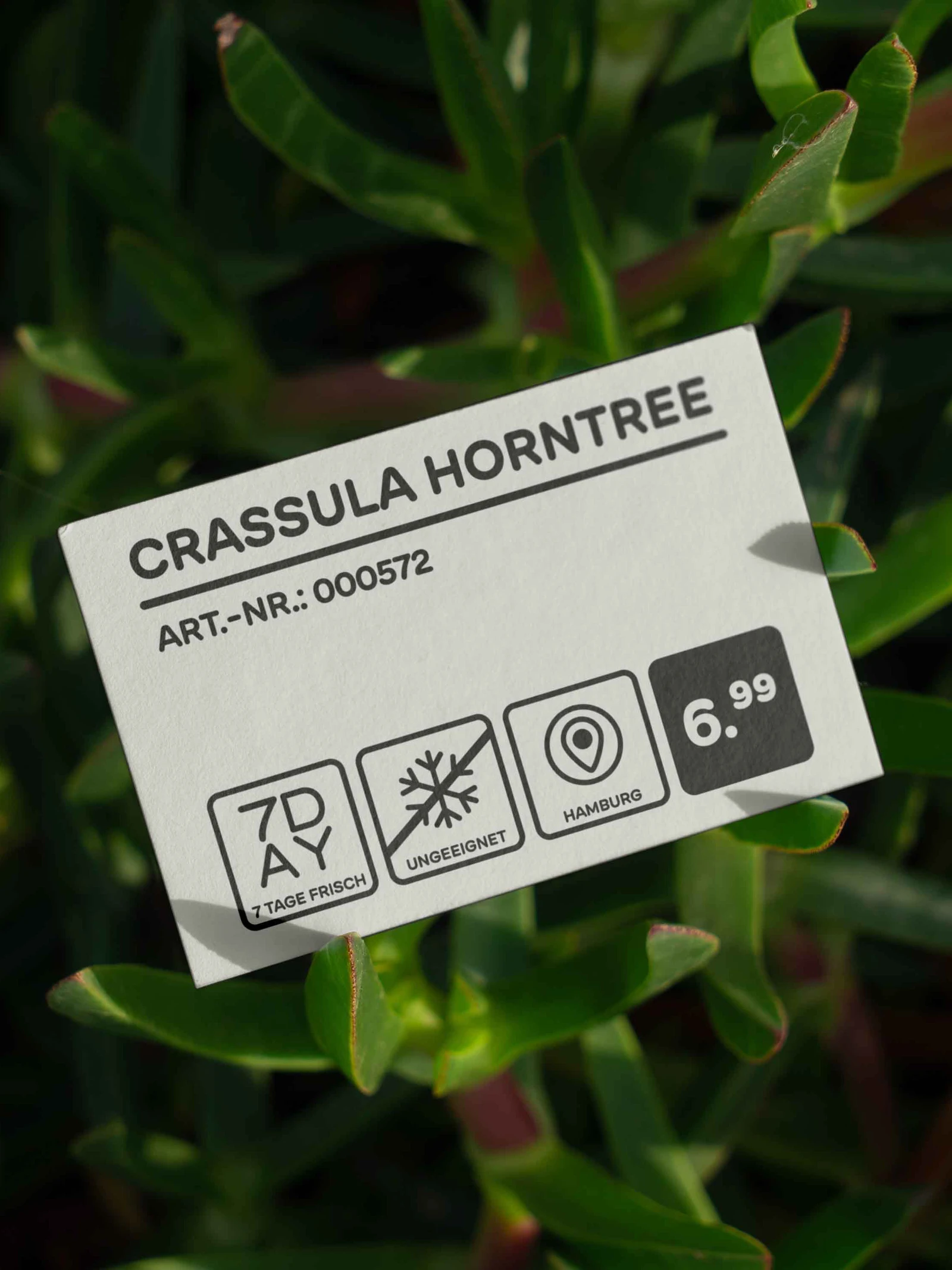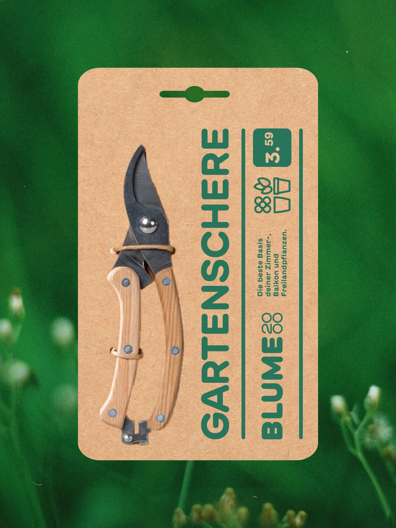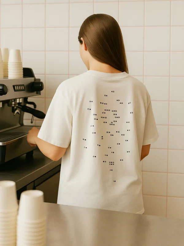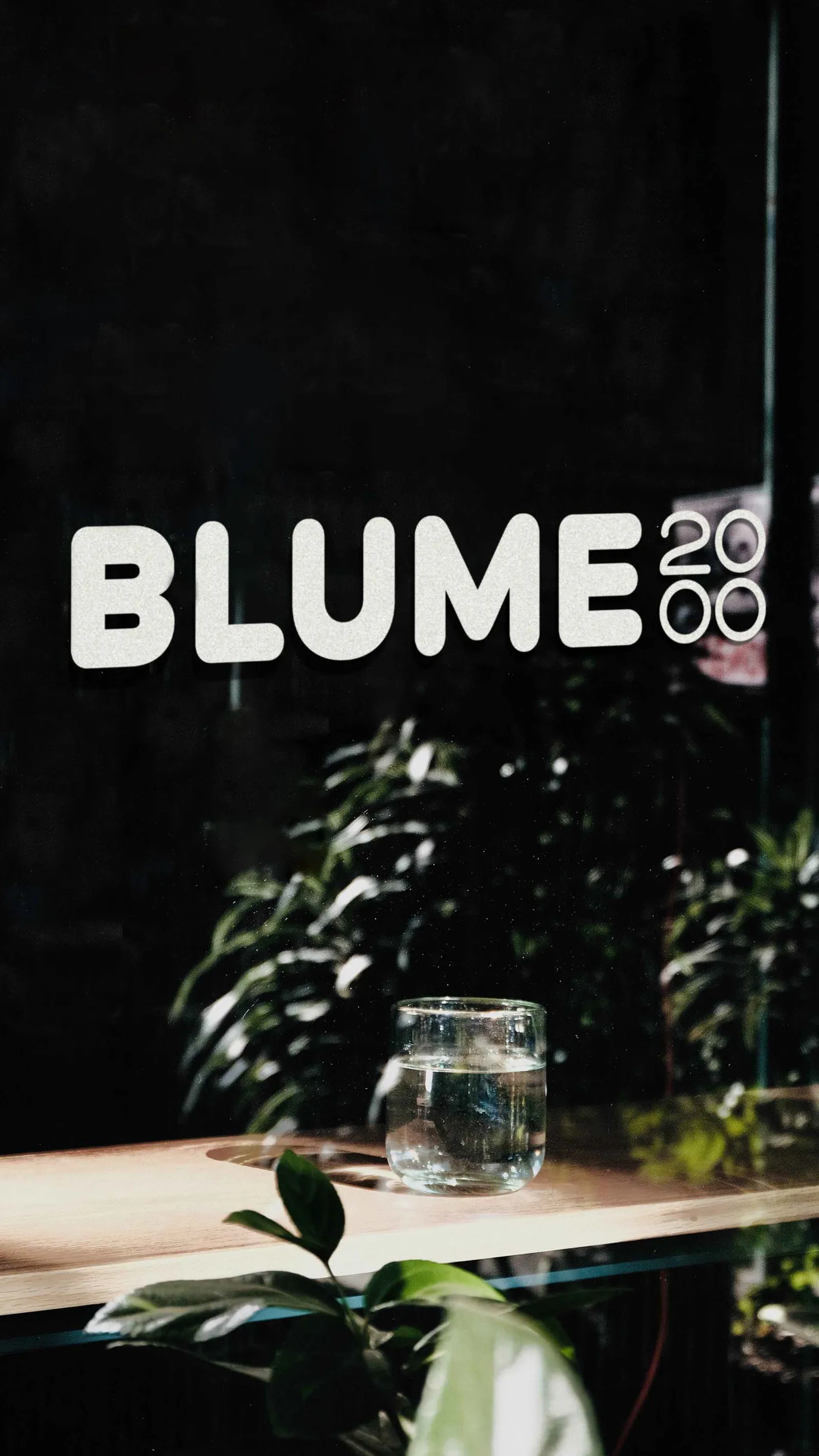
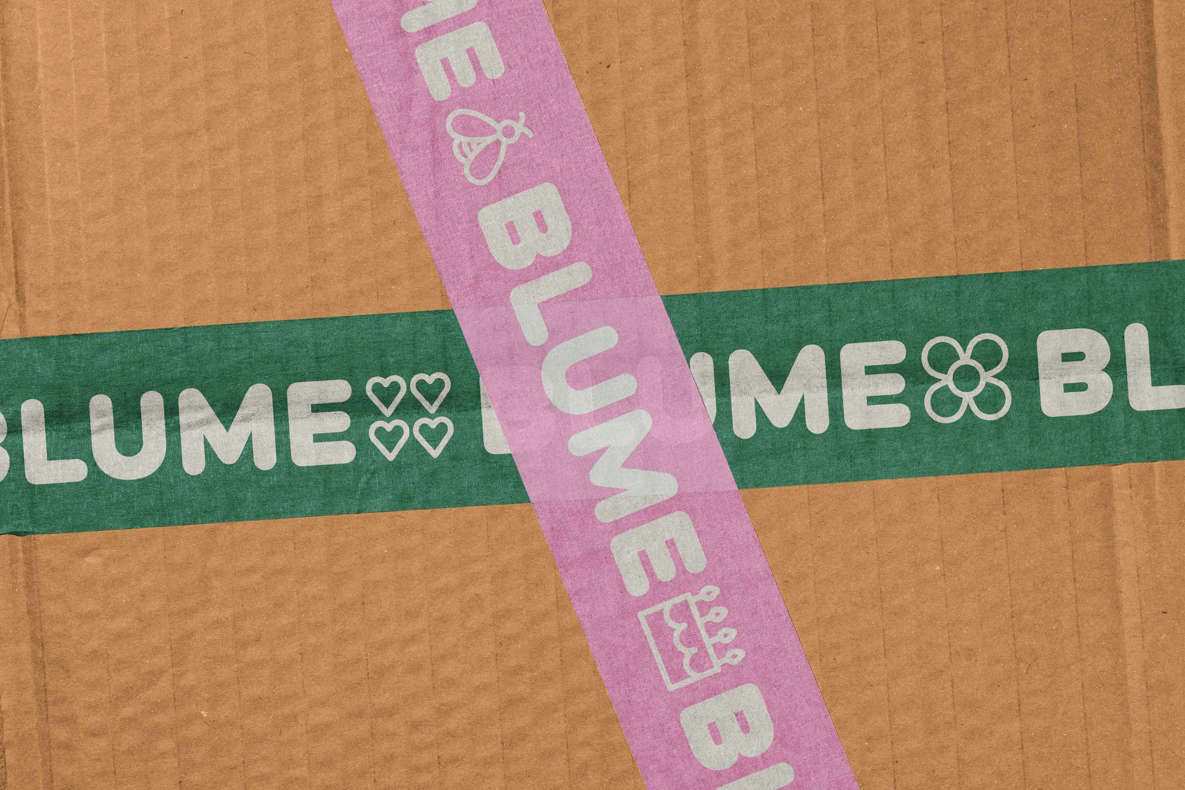
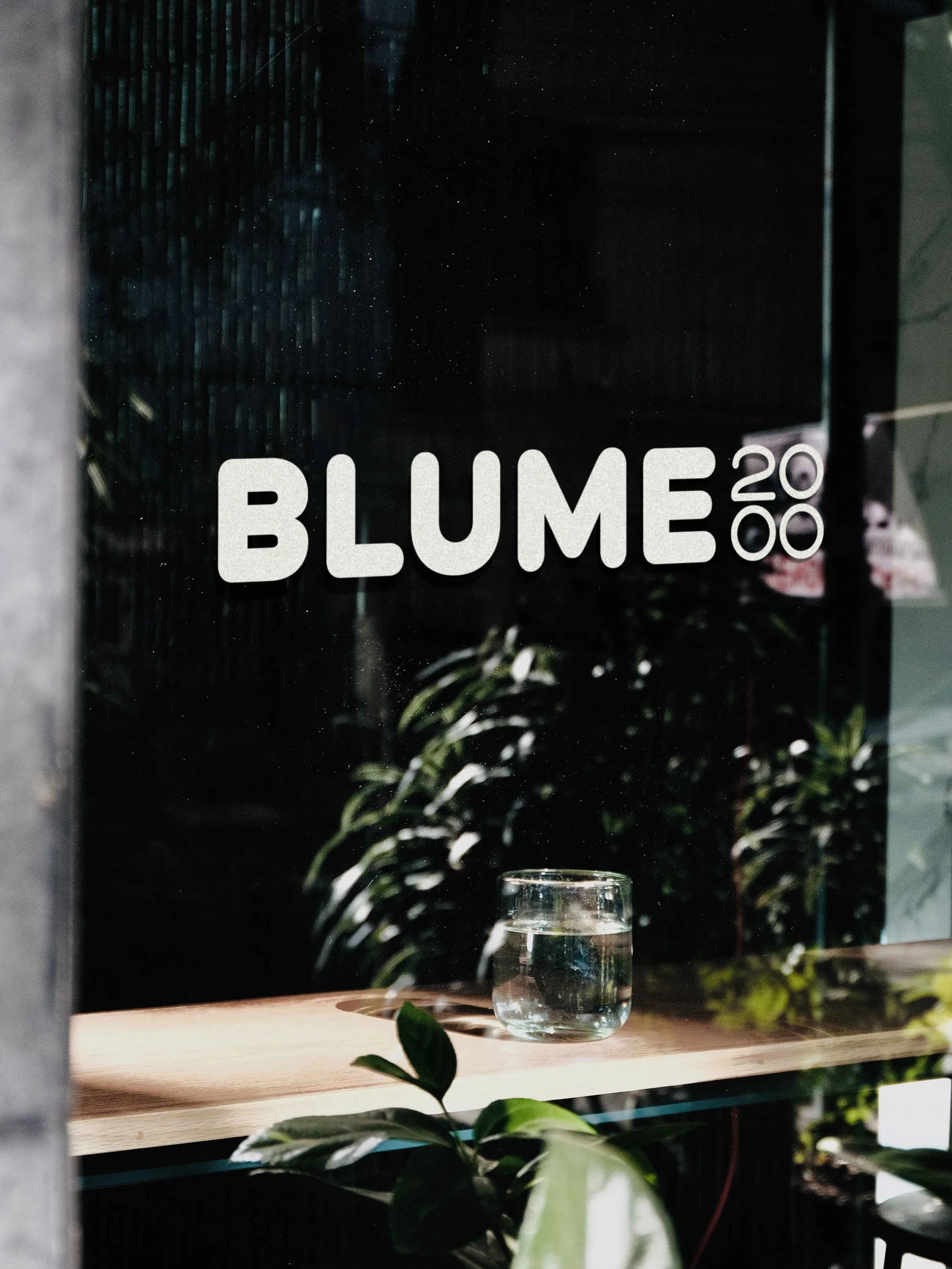
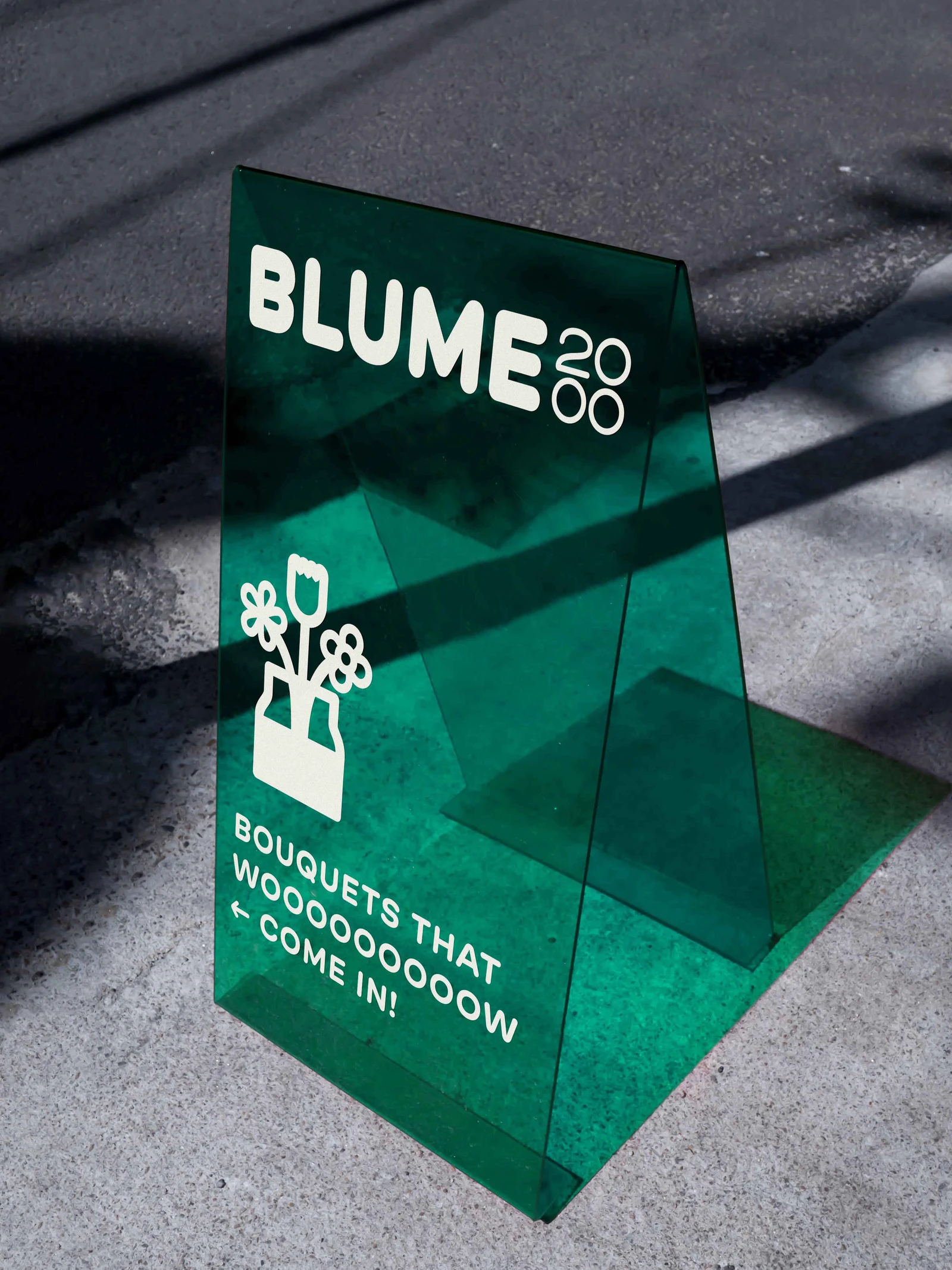
The rebrand moves Blume2000 toward a more contemporary, minimalist, and bold identity. The original two-line logo with its red outline gives way to a clear single-line wordmark, with “2000” set in a distinctive four-square grid that can be swapped for a range of icons. A secondary mark, built from the initial “B” and “2000,” serves narrow surfaces.
The color palette shifts: primary tones move toward calmer, more natural hues, while secondary colors turn fresher and more vibrant, underscoring the brand’s new sense of modernity.
Services: Rebranding, Logo Design, Illustration, Merch, Stationery, Store Image, Social Media
- Studio
- Studio Oeding
- Creative Director
- Katrin Oeding
- Team
- Stella Kornfeld, Anna Wank
- Project Management
- Katharina Vetter