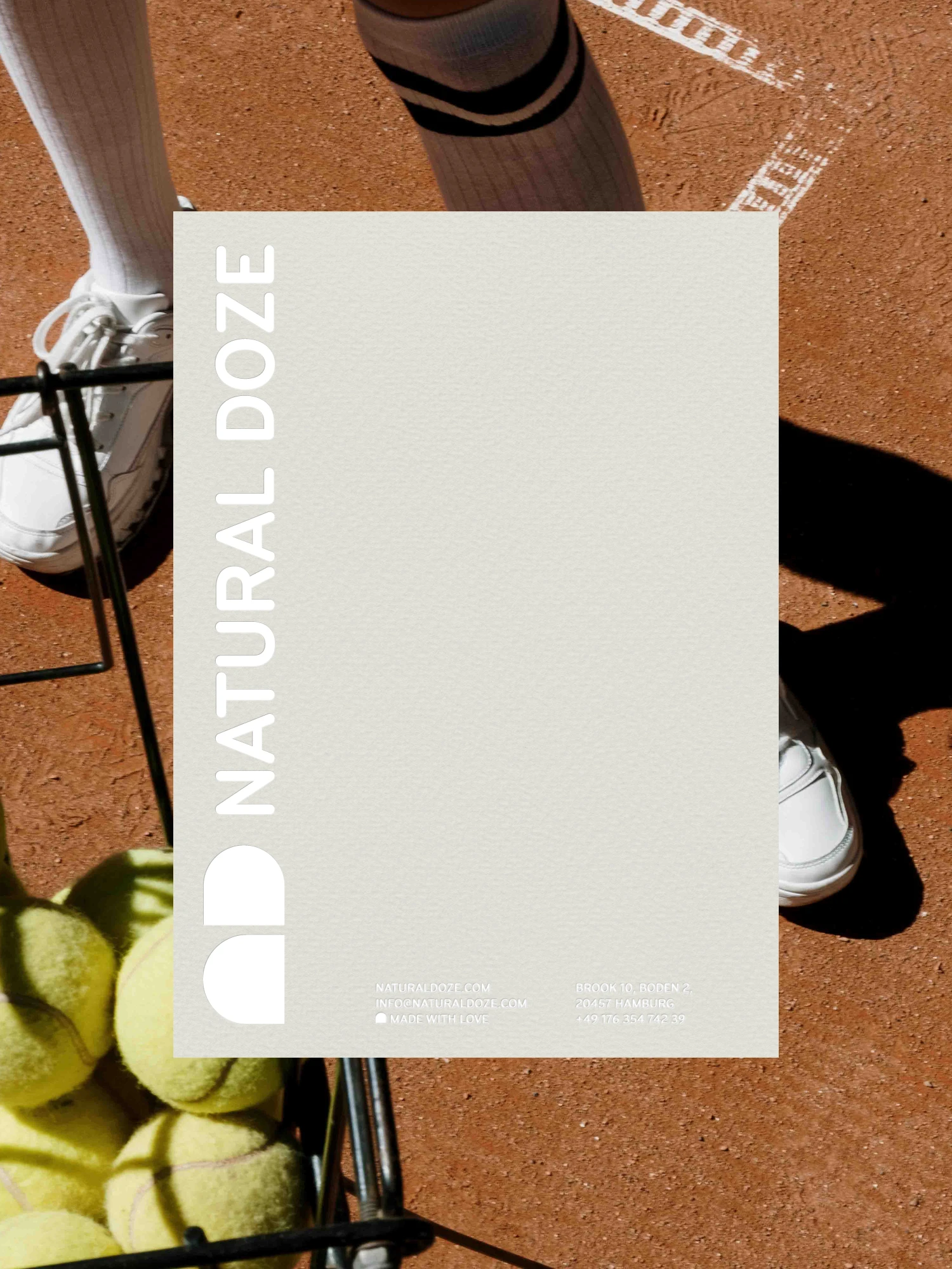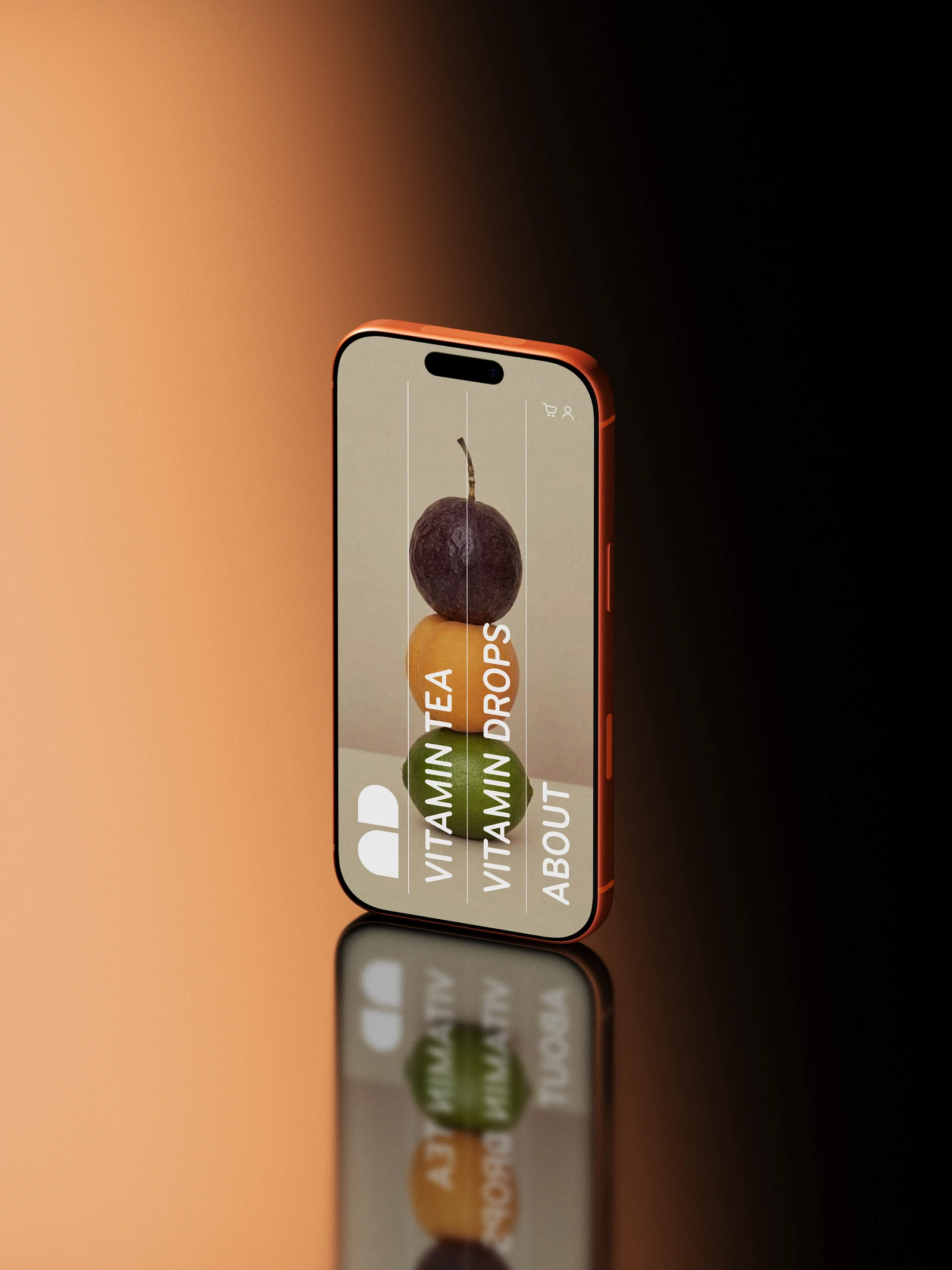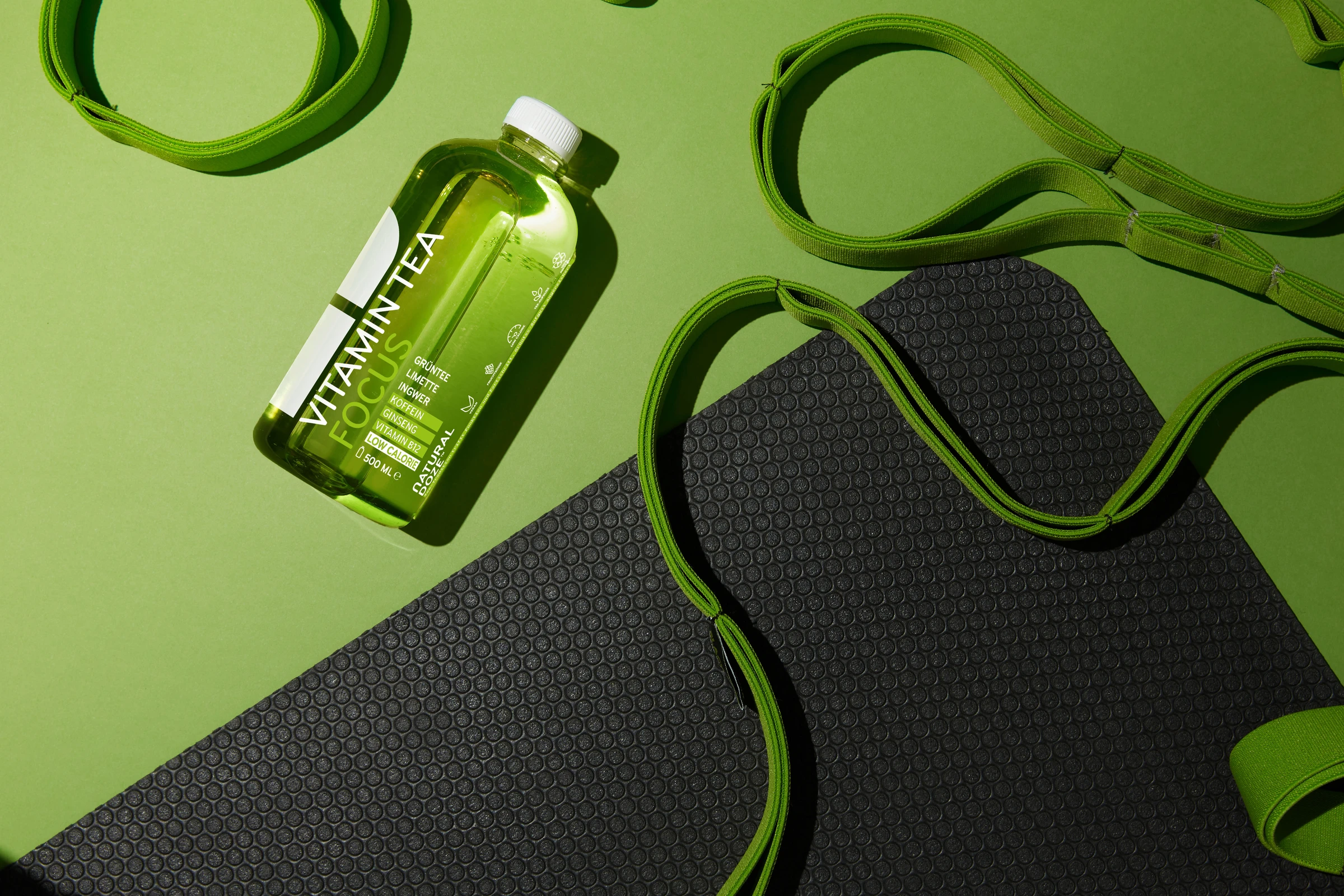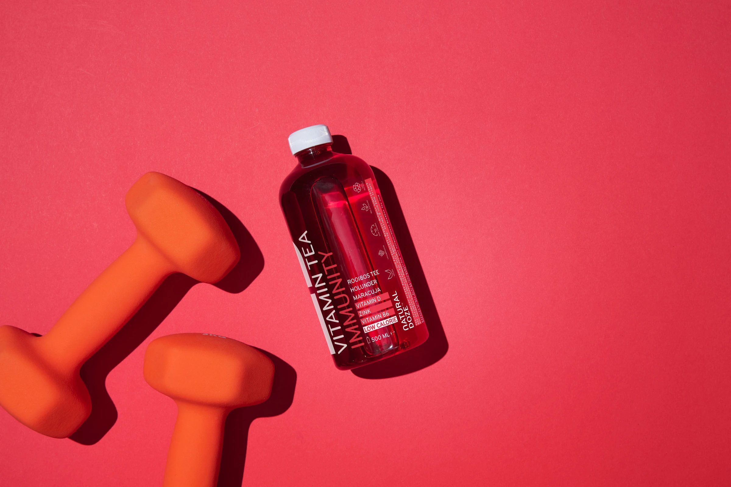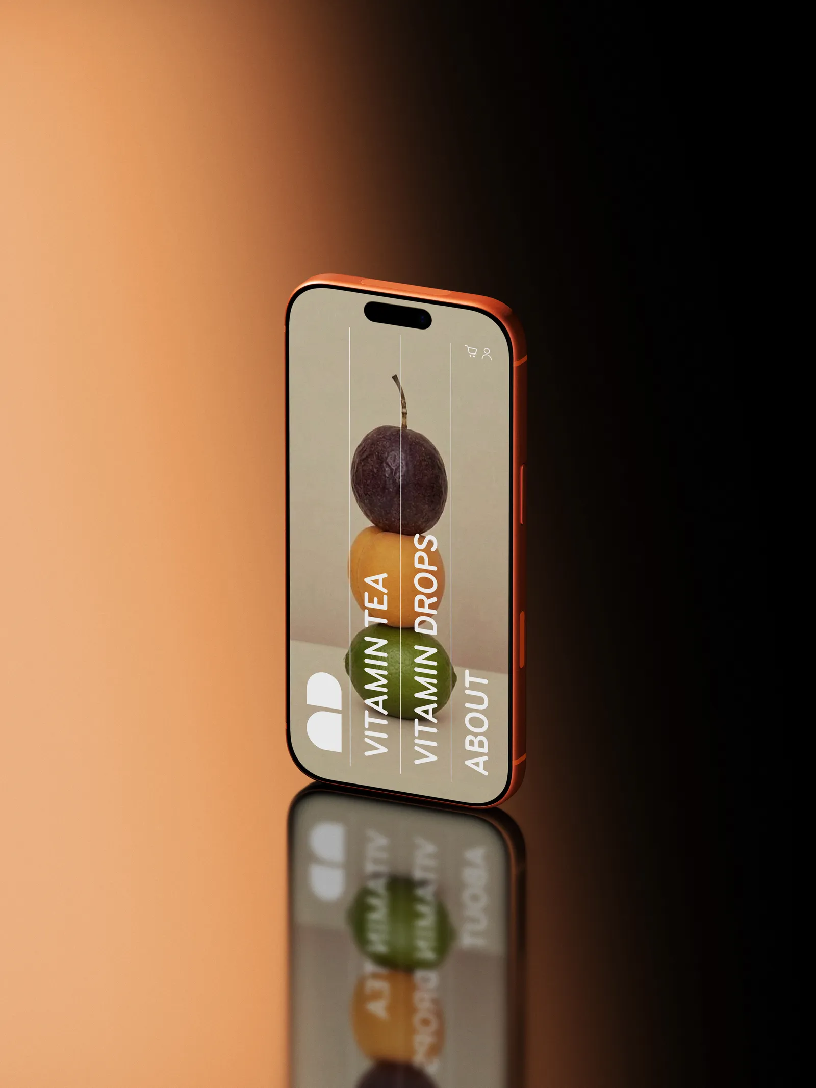
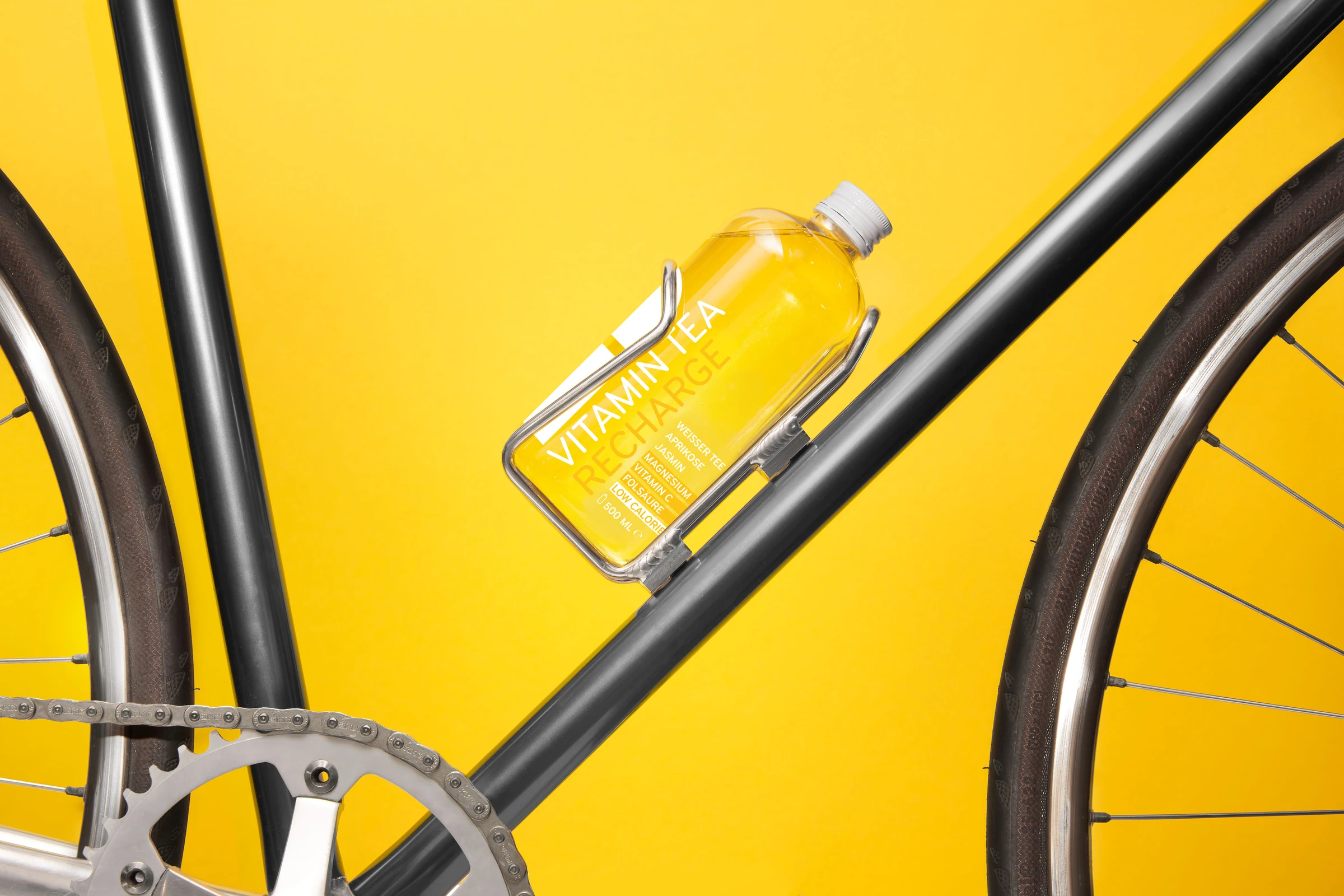
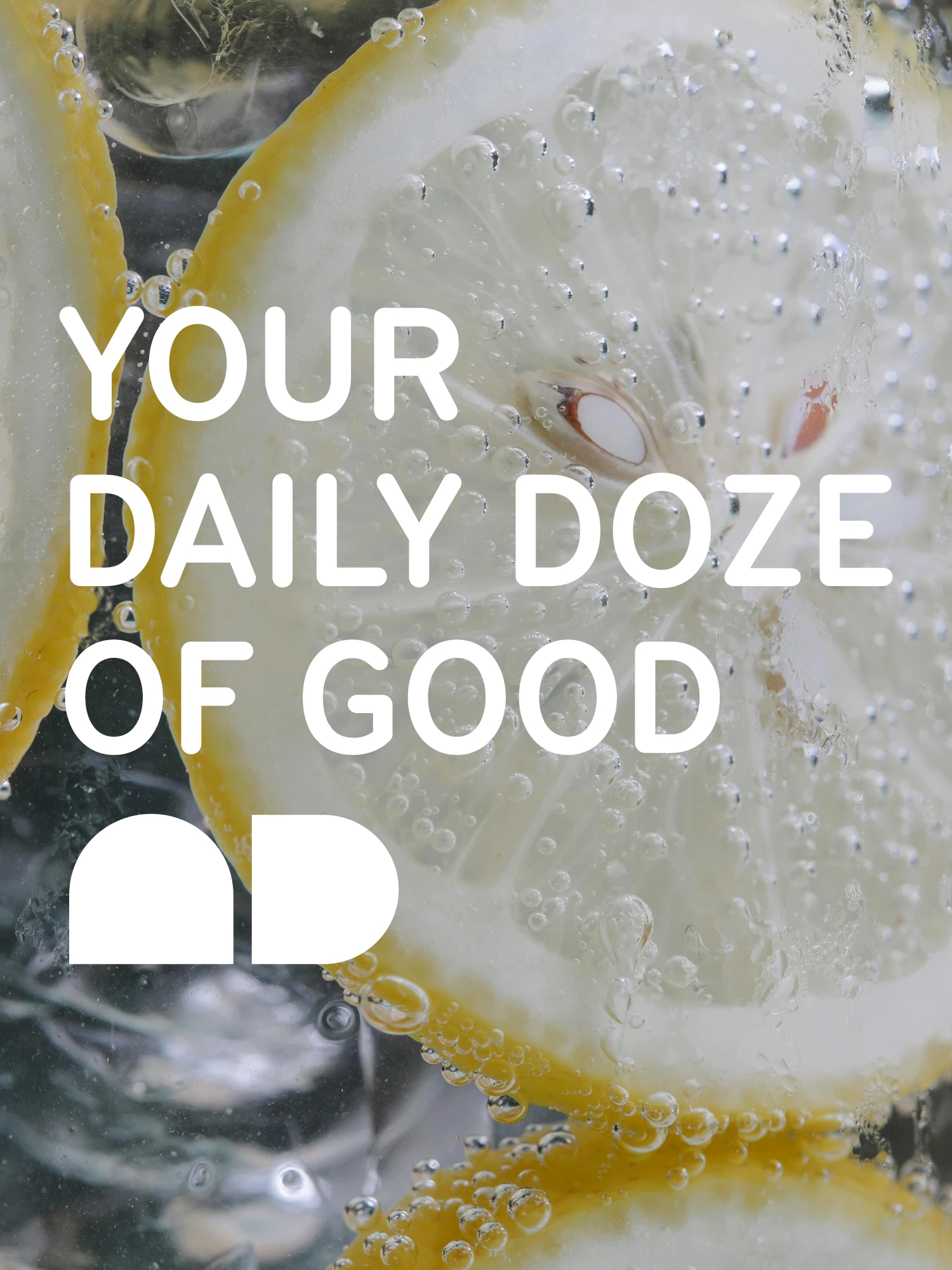
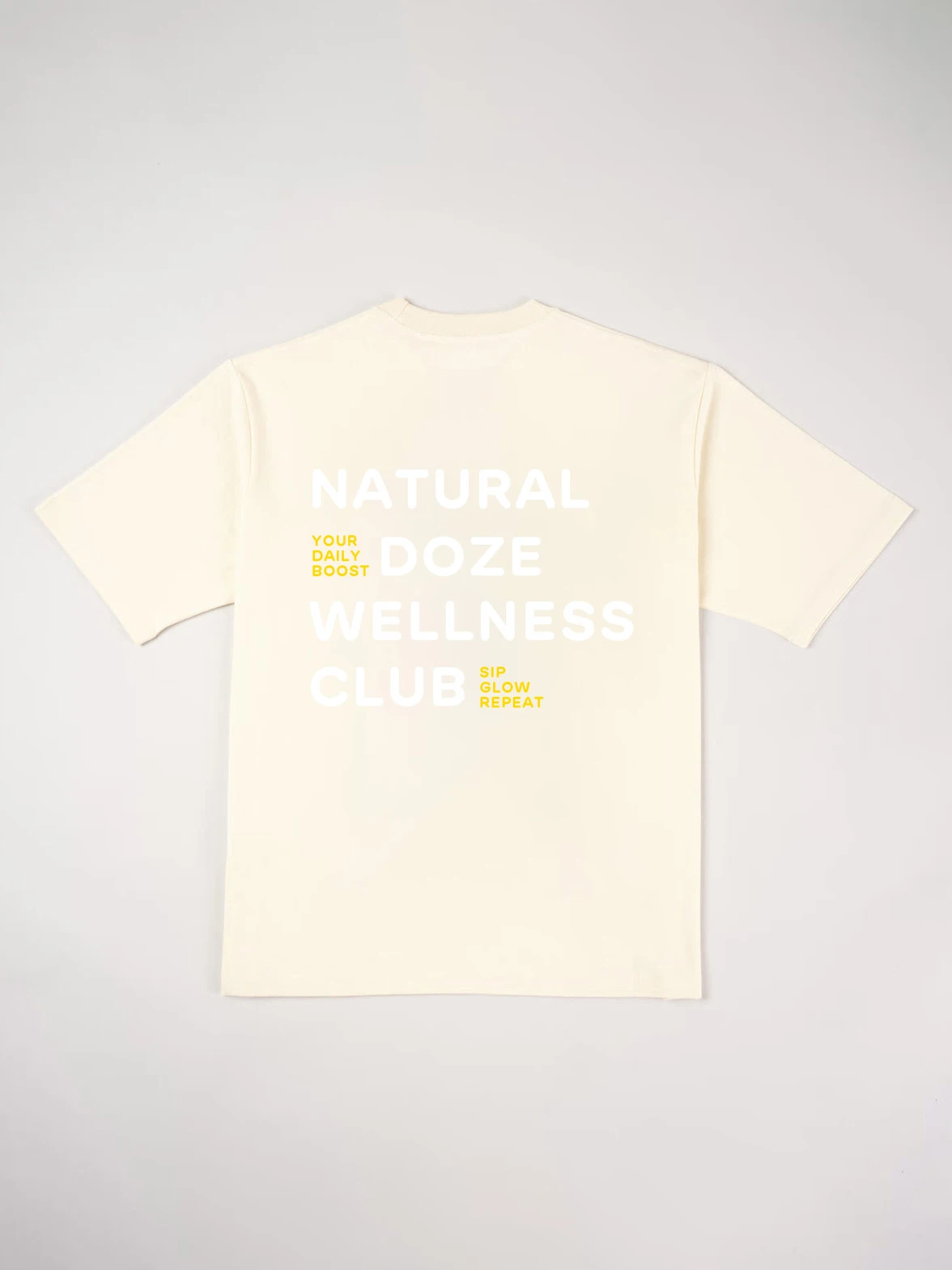
The lifestyle brand Natural Doze set out for a bolder, more youthful image and a streamlined product range. The existing font and logo were reinterpreted: the figurative mark, enlarged alongside product name and flavor, now sits rotated 90° and prominent on the front, with key information highlighted in color.
An intensive color code distinguishes each variety, drawn from the fruit or tea that defines its flavor, resulting in a vibrant, optimistic palette.
Services: Rebranding, Stationery, Social Media, Flyer, Merch, Website
- Studio
- Studio Oeding
- Creative Director
- Katrin Oeding
- Project Management
- Marcel Kohrs